When you click on links to various merchants on this site and make a purchase, this can result in this site earning a commission. Affiliate programs and affiliations include, but are not limited to, the eBay Partner Network.
It is a lot better then the factory layout, but I never understood why they didn't do it like this, exept that its far to bizzy with this specific licens plate as it has so many texts on it already...
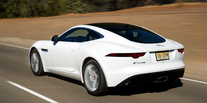
So I grabbed an image from the web with a more quiet license plate.. Dealer says JLR sees leaper & text as the logo, so inseperable..
Debadged the F-Type. Am normally an abnormally obsessed symmetry person. In this case, I left my R in place. I don't understand why I am not experiencing a mental short out over this.
You need to go at least one step further and get rid of the JAGUAR letters under the leaper!
OzXFR and Unhingd: I hear you. Waiting to see if the "J" gets loose like a bad tooth, then will take "aguar" with it. Perhaps a Winter project here in the Northeast U.S. I usually leave the emblems alone but the "F-Type" drove me over the edge.
Dan_NL: Thank you. The car had those wheels as an option and, with the other black accents, looked great on the showroom floor. Your wheels look very classy and fit our car well. Lots of options from the factory and I've seen a few posts here with stunning aftermarket wheels. Might be worth considering if you desire a change when new tire time comes around.
I discovered I can get the much praised wheels way cheaper here due to much lower transport cost.. ..
I will only change the wheels if they suffer from damage for some reason, like a pothole.
Tried to add this pic with my post above, but no joy.. .. so here it is;
The rays of light are the way it was then, no filter or editing, else then the license plate. Probably because the sun shines through the top of the trees, its works as a grid...
It does look "brilliant"...
Last edited by Dan_NL; 09-12-2018 at 07:28 AM.
Reason: arranging text better
Debadged the F-Type. Am normally an abnormally obsessed symmetry person. In this case, I left my R in place. I don't understand why I am not experiencing a mental short out over this.
Man what a color! I love how the newer style taillights are slightly darker.
@Jaggyx, do the letters - which I assume are OEM's - still fit nicely that rounder shape of the body compared to the spoiler?
Yes, they're the OE parts I picked up at the dealer which come with the template as well to ensure correct spacing. The curvature of the bumper doesn't pose an issue at all since the letters are quite small and the sponginess of the tape compensates for any curvature. I can take a few shots once I wash the car as it's been raining non-stop here in Austin.
Debadged the F-Type. Am normally an abnormally obsessed symmetry person. In this case, I left my R in place. I don't understand why I am not experiencing a mental short out over this.
Love that color with the black! - serious badazery. Get any grief from the PoPo for those tailights?
If it were mine, I'd black out chrome badging, delete the R badge, and ceramic coat the exhaust tips black... Just sayin...
Yes, they're the OE parts I picked up at the dealer which come with the template as well to ensure correct spacing. The curvature of the bumper doesn't pose an issue at all since the letters are quite small and the sponginess of the tape compensates for any curvature. I can take a few shots once I wash the car as it's been raining non-stop here in Austin.
Don't mind those pictures - I couldn't resist any longer, ordered a badge set, an copied you approach All credits to you for the great idea!
Subtle, and it really looks like it is stock.
Always wondered a bit JLR's idea to put brand and logo on the spoiler, since when applied, both are upside-down...
Like this way more than the original badge layout.
 09-11-2018, 05:09 PM


 All credits to you for the great idea!